What Does Color Temperature Indicate?
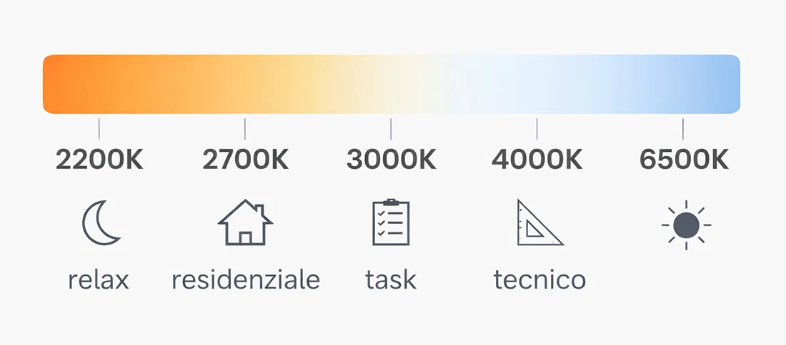
Color temperature is measured in Kelvin (K) and describes the hue of the light emitted by a light source. The lower the Kelvin value, the warmer and softer the light; conversely, the higher the Kelvin value, the cooler the light.
It’s important to clarify one point: Kelvin degrees do not indicate light intensity—they define how the light is perceived.
What does this mean? A warm light can be either soft or intense, just like neutral or cool light. The brightness, i.e., how strong or luminous a light is, does not affect its color.
The three most common color temperature values are:
- 2700° K: warm and soft light, similar to traditional incandescent bulbs.
- 3000° K: warm but more neutral and clean, balanced and modern.
- 4000° K: neutral, leaning toward cool; technical and functional.
But the difference is not just about color. Color temperature affects shadows, contrast, material rendering, and the sense of visual comfort.
For example, a wooden wall completely changes character—and even color—depending on the light that hits it. A wooden beam ceiling can look entirely different when illuminated correctly. Learn how to best light a wooden beam ceiling in our guide.
2700 K, 3000 K, and 4000 K: What Really Changes in a Room?
Color temperature can completely change the character of a space. Here’s how the three most common temperatures influence the atmosphere:
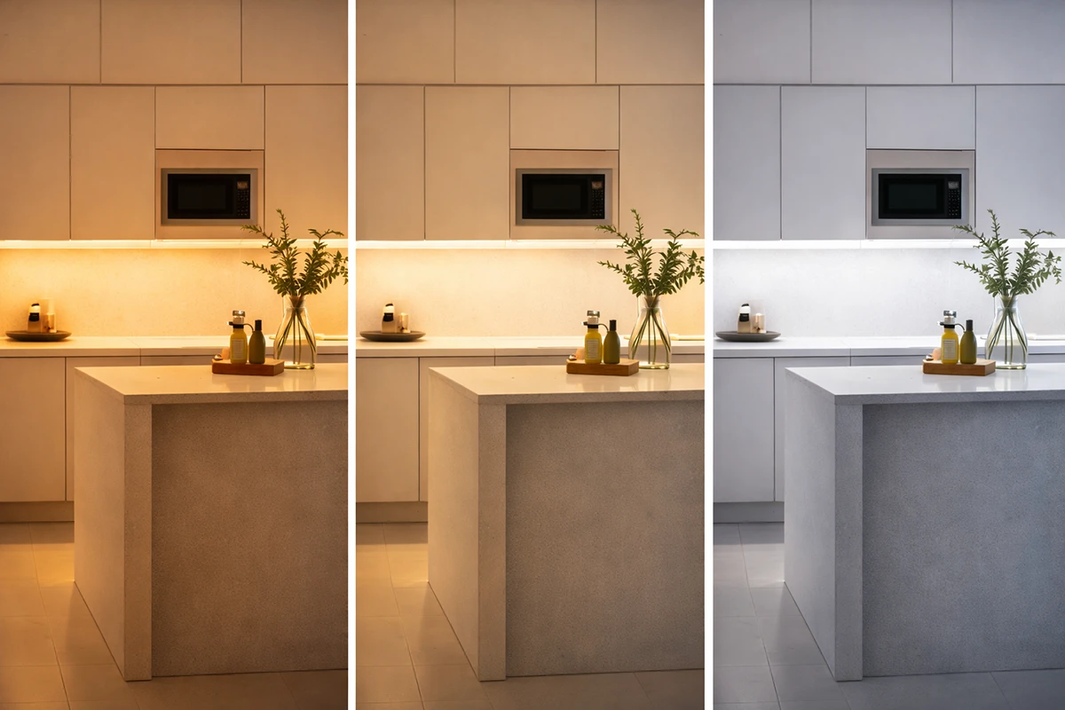
2700 K: creates Emotion and Intimacy
A 2700 K light emphasizes comfort and atmosphere. It’s enveloping, softening shadows and contrasts, making spaces feel more intimate.
Ideal for bedrooms, evening living rooms, lounges, hospitality spaces, and areas dedicated to relaxation.
Examples of warm light applications can be found in our guides: restaurant lighting and hotel lighting.
3000° K: illuminates with Balance and Versatility
3000 K is the most commonly used light in contemporary projects. Warm yet neutral, it enhances spaces while maintaining an elegant aesthetic.
Perfect for kitchens, open-plan living areas, hallways, and multifunctional spaces that change use throughout the day.
With led lighting, which can have any color temperature, these spaces can be lit efficiently with energy-saving bulbs.
4000° K: functional and Precise Spaces
When visual precision is essential, 4000 K is ideal because it provides a more neutral light. Recommended for mirrors, work surfaces, offices, or operational areas.
Read our office lighting guide to learn how to use these lights effectively.
Want to know how to light your terrace as well as your home? Check out our article: How to light a terrace at any time of day..
Why Isn’t One Light Enough?
A common mistake is thinking that each room is static and only needs a single type of light.
In reality, every room has different moments and functions throughout the day, and the light should adapt to all of them.
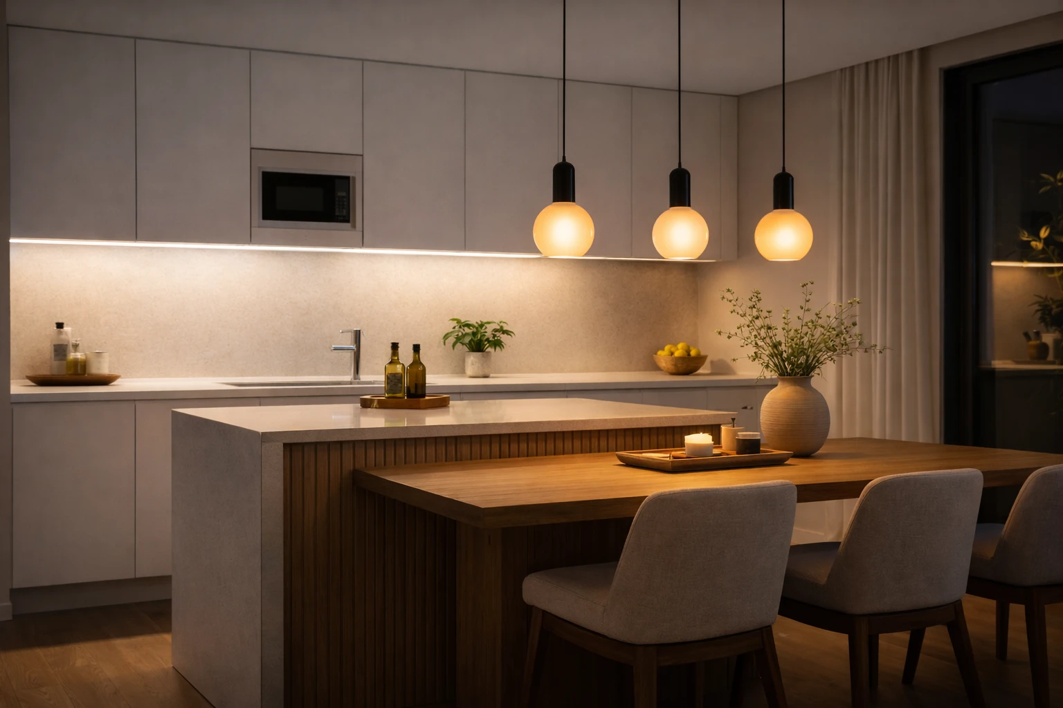
A well-designed lighting project layers light on multiple levels, each with a specific function that interacts with the others:
- Functional lighting: Designed for specific tasks, like cooking, reading, applying makeup, or working. Examples include reading lamps in relaxation areas, desk lamps for workstations, illuminated mirrors in bathrooms, or portable lamps for flexible use. In kitchens, a neutral 4000 K light over a work surface can be combined with technical systems or high-performance ceiling lights for optimal visual comfort and color rendering. In bathrooms, a 4000 K mirror light is essential for precision tasks.
- Atmospheric lighting: Transforms a space into an experience.
Can be created with floor lamps in relaxation zones, wall sconces for indirect light, LED spotlights for accents, or integrated LED profiles in architecture. In a living room with a 3000 K base, warmer 2700 K accents can be added in relaxation areas or a dedicated reading corner.
Examples of Layered Lighting in Different Rooms
Living Room
Base diffuse light: 3000 K (via pendant or suspended fixture):
- floor lamps at 2700 K in cozy areas
- wall sconces for indirect lighting
- LED spotlights to highlight artwork or textures
This approach adds depth and visual interest, not just illumination.
Kitchen
Layering is also applied through different Kelvin values:
- • Functional light: 4000 K on work surfaces
- Decorative pendant: 3000 K above the table
- integrated LED profiles for architectural continuity
Bathroom
Even in the bathroom the lightning has to be strategic, we'll use:
- diffuse light: 3000 K (wall lamp or ceiling fixture)
- mirror light: 4000 K for precision
- atmospheric light: 2700 K, dimmable or indirect, for relaxation (hidden LED lightining)
Using multiple color temperatures allows spaces to adapt to different moments of the day.
The Often-Overlooked Factor: CRI (Color Rendering Index)
Color temperature alone does not define light quality. The parameter that completes the picture is CRI—the Color Rendering Index.
What is CRI?
CRI measures a light source’s ability to reproduce colors accurately on a scale from 0 to 100:
- CRI < 80: Colors appear distorted, flat, unnatural
- CRI 90+: High color fidelity, ideal for high-quality environments

Color temperature alone does not define light quality. The parameter that completes the picture is CRI—the Color Rendering Index.
High CRI enhances wooden surfaces, fine fabrics, and natural stones, even at the same light intensity. It’s perfect for bathrooms, makeup areas, kitchens with natural materials, showrooms, retail, creative studios, and spaces with artwork.
Dynamic Lighting: Light That Follows the Rhythm of the Day
Smart control systems now allow modulation of both intensity and color temperature.
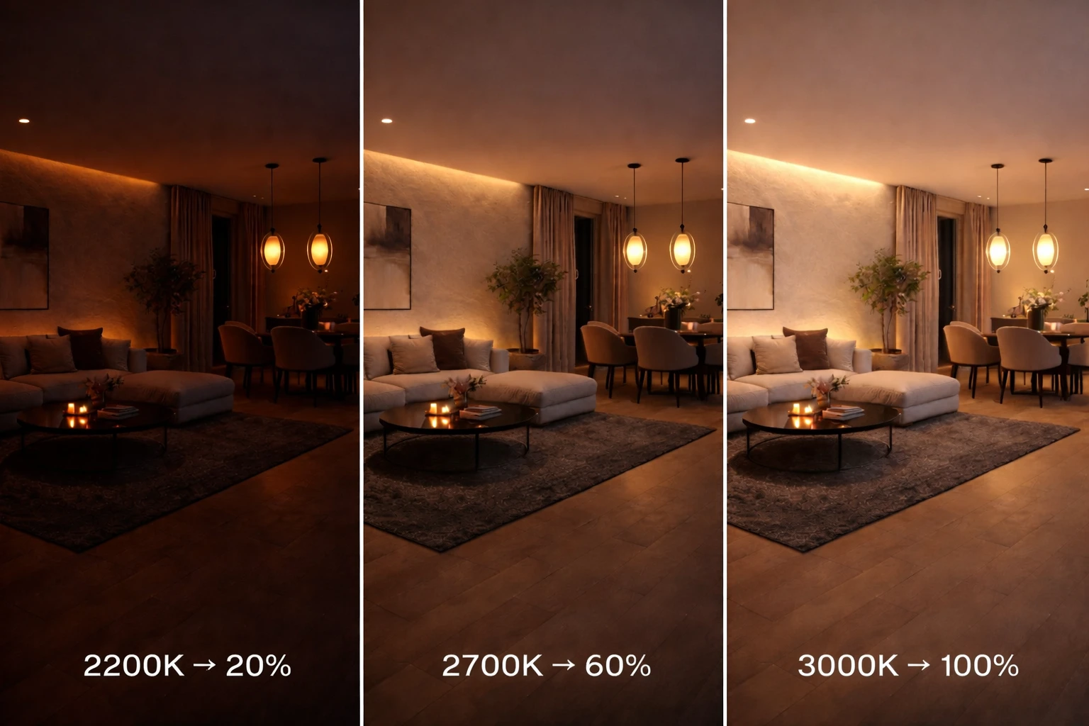
Dynamic lighting makes spaces more usable, adapts to our natural rhythms, and improves wellbeing.
Conclusion: Color Temperature as a Design Tool
Choosing the right color temperature—2700 K, 3000 K, or 4000 K—profoundly affects how people perceive a space.
Each color temperature has a specific role and perceptual effect, making it perfect for a particular context.
At LuceControCorrente, we design lighting starting from what really matters: materials, functions, and atmosphere. Well-integrated light doesn’t disturb or impose—it disappears from view yet is still perceived.
Discover our solutions for indoor and outdoor lighting.
